Here’s a new version of the Draft Pick Value Chart
Info:
Based upon a smoothed monotonic regression (monreg package in R) using the first seven years (post draft) of time on ice (TOI) for players drafted at each pick in the NHL draft (through the 210th pick). The data used for this draft value pick chart (DPVC) are the 2003 to 2008 NHL Draft classes. The chart is scaled (and rounded) so that the first pick has value 1000. A graph of the chart is given below.
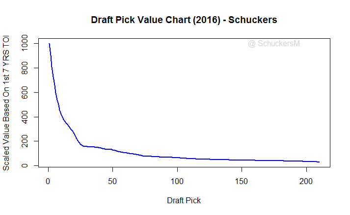
Figure 1: Plot of 2016 version of Draft Pick Value Chart
I’ve previously done two charts for assigning value to draft picks. The first and still most popular was done in 2011 and used games played as the outcome measure for players drafted from 1988 to 1997. That is here: 2011 DPVC (As always in these sorts of analyses we have to use historical data.) More recently in 2014 I put together a DPVC for an early version of a paper I published with Steve Argeris. While the focus of that paper was evaluating how teams draft relative to the NHL’s Central Scouting Service, we put together a DPVC based upon the first seven years of TOI for players drafted from 1998 to 2002 based upon the idea that teams generally have rights to a player for seven years after they are drafted. The DPVC did not make the final version of the paper which appeared in the Journal of Sports Analytics in 2015. Here’s the link to the original version of that paper with the DPVC: Schuckers and Argeris.
The 2016 version above uses the same methodology as the Schuckers and Argeris paper but using first seven years of TOI from the 2003 to 2008 NHL draft classes. The basic idea of a DPVC is to develop a value on a particular draft pick to have a starting point for possible trades. We have used a statistical method that forces the value of draft picks to be decreasing because that is what I believe inherently should be the structure of a DPVC. (Even though, for example, in these data the average TOI for the 9th pick is higher than the average of the 8th pick.) I just don’t think that you should value a pick which give you fewer choices to have higher value than one that gives you more choices. As I said whenever I’ve talked about this chart, it is a guide and you have to also consider other information you have about the draft and the players available.
David Wilson, a student at Carleton University, who I co-advised has noted that there is some evidence that players selected in the fifth round outperform those taken in the 4th round, at least for the drafts from 1998 to 2008. David presented some of this work at the Vancouver Hockey Analytics Conference. David is the second speaker in Session 5.
Methodology Details: I’ve used a small bandwidth both for density and kernel estimation in order to capture edge effects, 0.04. I went to small values of these parameters while also trying to maintain smoothness. This was also done to try to avoid edge effects on lower, i.e. earlier, draft picks. For fitting of these data, I used all of the rounds for 2003 to 2008 to avoid some edge effects at higher draft picks. That is, I used, for example, all 292 draft picks from the 2003 draft and all 230 picks from the 2005 draft. Here is the command I’ve used in R: monreg(DraftPick,First7TOI,t=210,hr=0.04,hd=0.04,degree=1)
POSTSCRIPT (June 8, 2016): Note about differences from the 2011 DPVC to the 2016 DPVC
I’ve gotten some questions about the above chart and in particular the differences between this chart and the 2011 version (here). The 2016 version is steeper than the 2011 version. There are several differences that could account for this. First, in the 2011 version I used career games played (GP) as the response while in the 2016 version I’ve used TOI in the first 7 seasons. So it is possible that the different responses would result in different weightings for draft picks and different curves. Second, while obvious we are using different data for the two time periods — players taken in the 1998 to 2002 and the 2003 to 2008 drafts, respectively — so it is possible that there has been some changes in how players’ careers have gone during these time frames. Third,
Figure 2 below addresses the two issues from the paragraph above. For this graph, I’ve used the methodology described in the post above to fit the first seven GP and TOI data from ’98 to ’02 and from ’03 to ’08. The TOI curves are virtually identical. The blue is almost completely obscured by the red. (Note that both are scaled to have 1000 as the maximum values.) Similarly the differences between the the GP curves are very similar. There seems to be some slight differences in the first 20 picks and in the last 30 or so picks but given the likely variation in the curves they seem quite similar. Further, while there are differences between the GP and the TOI curves, their basic shape is pretty close. (This is not a surprise if we note that the correlation between first seven GP and first seven TOI is 0.932.) So the differences in the curves is not due to the different time frames and not due to the different response variables.
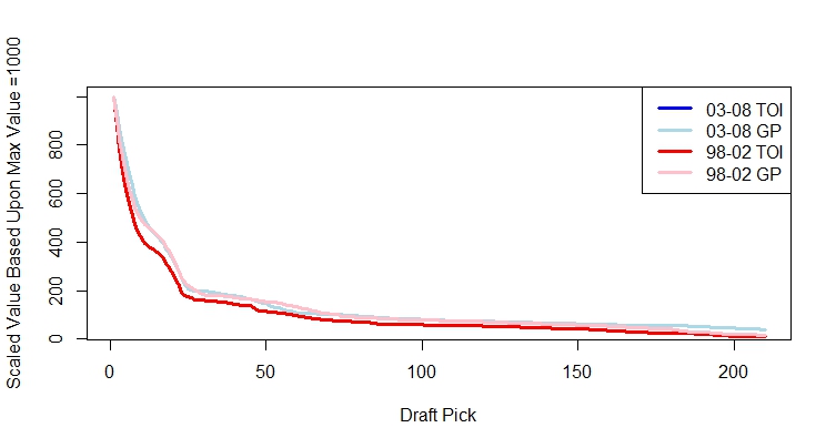
Figure 2: Comparison of GP vs TOI and 98–02 vs 03–08
The difference seems to be due to the differences in the methodology that I used to create the two curves. Figure 3 below illustrates this issue which is somewhat a function of restricting myself to a monotonic (continuously decreasing) curve and somewhat a function of the smoothing parameters. The response data in Figure 3 is the TOI data from 03–08. The blue curve is the version given in the 2016 DPVC, the other versions are from taking different values of the smoothing parameters within the monreg function. The lightest grey one, topmost curve over the first 50 picks, is the one that seems closest to the 2011 version. (Technical note: In 2011 I used the loess function to make the DPVC while I am now using monreg.) This time I’ve gone with a curve that is a bit less smooth but, hopefully, better reflects the data. Ultimately I am making a choice here between overall smoothness and fidelity to the data. Inherently I believe that a DPVC should be relatively smooth and so I’m not inclined to have something with steps like the black line of Figure 3 (even less smooth than the blue line) but I want to keep with the data so I’ve moved from the light grey line which is very smooth.
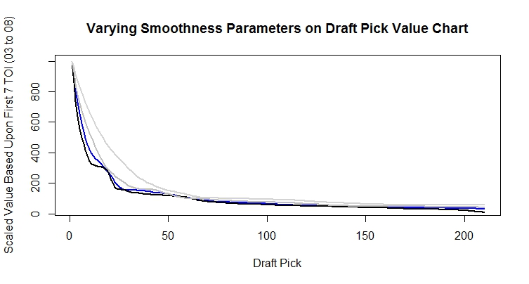
Figure 3: Different 03–08 1st 7 TOI Curves based on vary smoothness parameters


Leave A Comment